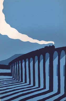
 I find screen printing the perfect alternative to watercolour painting. In the latter I enjoy the way the fluid medium develops a life of its own, creating texture and tone according to the amount of water there is against the amount of pigment. In screen printing the weight of flat colour, the element of design and the fun of juxtaposing contrasting forms make for a very different, but just as absorbing a process. The greatest joy comes at the final stage because, no matter how precisely you think you have imagined the finished piece,when the last layer is printed there is always an element of surprise. It never looks quite as you thought it would. Screen printing offers a wealth of choices at every stage. To give you an idea of the possibilities within a relatively straight forward design I've shown some of the stages involved in a print of Brighton's West Pier. 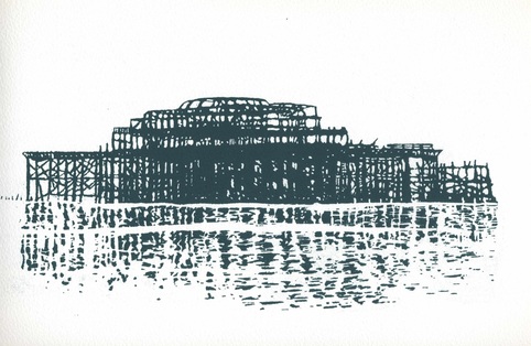 I made this screen of the ruined West Pier in Brighton from a pencil drawing. I liked the stark outlines and the fractured reflection but I thought it might be interesting to print it over a background layer. 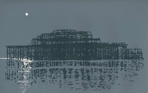 Taking my cue from the sombre nature of the image I added this background. Its a favourite mix of mine made from black and yellow inks. I thought the moon gave it just the right atmosphere. 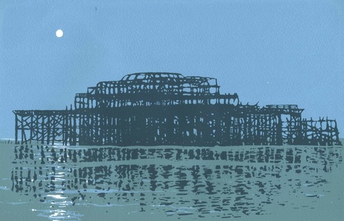 Then, as a further experiment, I introduced a horizon and a lighter background to bring out the contrast of the dark twisted girders against the paler sky. I like all of these, but I know one of them really does it for me. Which do you prefer? If you'd like to learn how to screen print I have two courses coming up: an introductory course - for details CLICK HERE and a slightly more advanced, although still very accessible, course - for details CLICK HERE 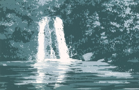 To see a larger range of my screen prints go to Masham Gallery: CLICK HERE To visit my Facebook page CLICK HERE
0 Comments
Leave a Reply. |
Archives
June 2024
|