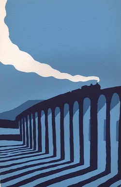
 I find screen printing the perfect alternative to watercolour painting. In the latter I enjoy the way the fluid medium develops a life of its own, creating texture and tone according to the amount of water there is against the amount of pigment. In screen printing the weight of flat colour, the element of design and the fun of juxtaposing contrasting forms make for a very different, but just as absorbing a process. The greatest joy comes at the final stage because, no matter how precisely you think you have imagined the finished piece,when the last layer is printed there is always an element of surprise. It never looks quite as you thought it would. Screen printing offers a wealth of choices at every stage. To give you an idea of the possibilities within a relatively straight forward design I've shown some of the stages involved in a print of Brighton's West Pier. 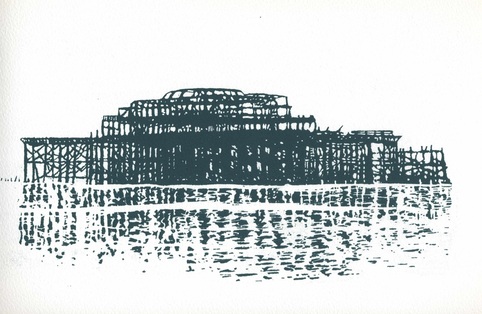 I made this screen of the ruined West Pier in Brighton from a pencil drawing. I liked the stark outlines and the fractured reflection but I thought it might be interesting to print it over a background layer. 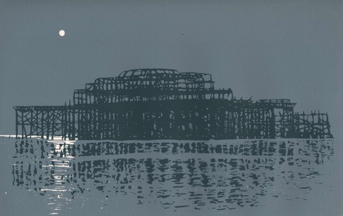 Taking my cue from the sombre nature of the image I added this background. Its a favourite mix of mine made from black and yellow inks. I thought the moon gave it just the right atmosphere. 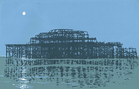 Then, as a further experiment, I introduced a horizon and a lighter background to bring out the contrast of the dark twisted girders against the paler sky. I like all of these, but I know one of them really does it for me. Which do you prefer? If you'd like to learn how to screen print I have two courses coming up: an introductory course - for details CLICK HERE and a slightly more advanced, although still very accessible, course - for details CLICK HERE 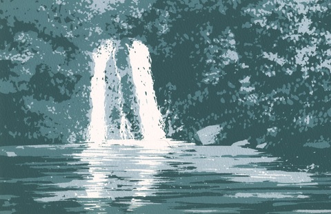 To see a larger range of my screen prints go to Masham Gallery: CLICK HERE To visit my Facebook page CLICK HERE
0 Comments
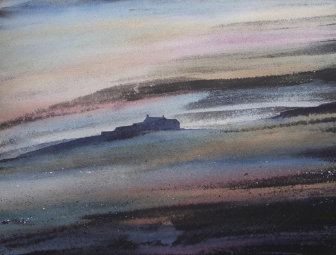 I never cease to be amazed at what watercolour can do. Over the years I have added all sorts of things to the stuff - gouache, acrylic ink, wax, sepia - but just recently I've been adding a lot of indian ink. As I've been developing paintings for my summer exhibition - Tales of the Dales (details below) - I have found that I wanted a richness and a gravity to reflect the mystery and the dark nature of some of the stories. Indian ink, as the name suggests, comes from China, along with oil paint, gunpowder and chess. It has a wonderful couple of properties. On the one hand it will give deep stains into watercolour paper, but on the other hand it will not leave a mark when certain kinds of resists are used. 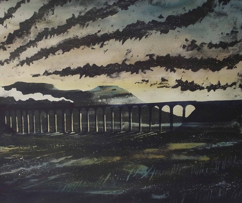 This is the method I've been working with recently. I've been combining it with rich glazes of watercolour which float over the indian ink and allow me to find the warmth (or lack of it) which the landscape I'm portraying requires. Above is Tan Hill Inn, England's highest pub, silhouetted against the sky. Left is The Ribblehead Viaduct one of the most amazing landscapes in the Dales. I wanted to capture the drama, the light and the way in which the viaduct becomes part of the landscape. In the painting its barely distinguishable from its surroundings. In this way I am, as always, trying to paint the personality of the landscape, and I feel its working. I hope visitors to the exhibition will think so too. 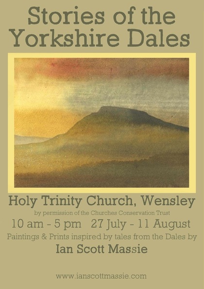 A date for your diary: the exhibition preview is at 7pm Friday 26th July at Wensley church. For further updates on the work for the this and other exhibitions visit my page on Facebook by clicking HERE or follow me on Twitter by clicking HERE. |
Archives
June 2024
|