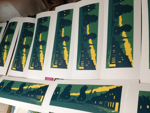
 Masham Market Place ©Ian Scott Massie 2013 Masham Market Place ©Ian Scott Massie 2013 I was looking at some 1920s railway posters recently and I really liked the way light is used in a lot of them. I'd wanted to do a print of Masham Market Place for a while and it seemed to me that this might be the approach to take and in keeping with the theme of Simplicity of Colour - the title of the forthcoming Masham Gallery Exhibition. I wanted to get the feel of a late summer evening with the light streaming out of the door of the Kings Head (on the right) and the dark shape of the Market Cross pretty dead centre.  This is the watercolour sketch for the idea which helped me think about the colouring and the main elements of the picture. Although this style of work has a very flat finish I wanted it to feel as though it was a picture you could walk into.  This is the print "map" - drawn to the same size as the finished print. The numbers are where I work out the order in which each layer of colour will be printed.  This is the completed pile of fourteen prints drying in the studio. Using the reduction system of printing means that you have to print the whole edition in one go. There are usually a couple of disasters but, on this occasion, every print turned out well. If you'd like a copy contact Masham Gallery by clicking HERE. Simplicity of Colour is at Masham Gallery from 21st September to the 3rd of November.
0 Comments
Leave a Reply. |
Archives
June 2024
|